Samuel Gritz Public House
Branding Case Study


Situation
Samuel Gritz Public House is a newly opened local restaurant looking to establish a strong, recognizable brand within a competitive neighborhood dining scene. While the food and concept were solid, the restaurant lacked a cohesive visual identity and clear brand positioning that could help it stand out and connect with the surrounding community.
I partnered with the owner to translate their vision into a cohesive brand identity, creating assets they could use on their website, social media, and marketing materials, while helping the restaurant stand out and connect with the community.

"We want to offer a kickass product at affordable prices."
– Frank Weiss, Samuel Gritz Public House
Challenge
Despite a 'kickass' product, Samuel Gritz lacked a visual anchor. The absence of a cohesive brand identity meant the restaurant’s personality wasn't translating to new customers, making it difficult to transition from a 'new spot' to a 'neighborhood staple' in a saturated market.
We focused on a dual-demographic approach: reaching the 75% local residency base—families and neighbors seeking an approachable 'third space'—while maintaining credibility with industry peers who value a quality-focused late-night spot.
Audience
The design challenge was a balancing act: crafting a visual identity that felt like a neighborhood legacy (established and trustworthy) while remaining fresh and 'New-Wave' to attract a modern dining crowd.
Objective
Strategy
The strategy centered on translating Samuel Gritz Public House’s warm, inclusive, and community-driven personality into a cohesive, flexible brand system.
Through discovery, we learned that their core identity is “kickass products at affordable prices” delivered in a welcoming, approachable space that feels elevated but not intimidating. Their goal was to become a neighborhood staple where anyone, from families to local professionals, can feel comfortable.


Visual Design
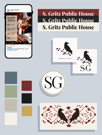
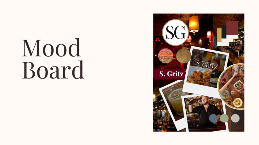
The brand’s visual identity draws from Samuel Gritz’s history and physical environment. The primary palette: deep red, gold, and charcoal, reflects the restaurant’s legacy, warmth, and grounded, elevated atmosphere.
The secondary palette: slate blue, sage green, and warm gray, adds balance and versatility, keeping the brand approachable and flexible across touchpoints like social media and menus.
Together, these colors create a cohesive, thoughtful system that communicates the restaurant’s bold, welcoming personality while remaining modern and adaptable.


To ensure the brand could live beyond the initial design phase, I developed a modular visual system. By delivering a comprehensive Brand Style Guide and a Digital Asset Toolkit, I empowered the ownership group to maintain visual integrity across menus, social media, and environmental signage without further creative oversight.
Designed with high-utility in mind, the system provides a clear roadmap for the multi-stakeholder ownership group, ensuring a unified brand voice regardless of who is executing the daily marketing tasks.
Implementation
& Scalability


Brand Impact
& Assets
The primary objective was to move the restaurant from a 'startup' phase to a 'scalable' brand. I delivered a comprehensive Brand Guideline that allows the owners to produce consistent menus, social content, and future merchandise without needing a designer for every small task.


